
گزینش سوالات
گفت و گو های مرتبط
دسته بندی سوالات
تگهای محبوب
ثبت پرسش جدید
![user-avatar]()
![user-avatar]()
![user-avatar]()

گزارش تخلف
کپی کردن
1
یک راه حل اینه که متن رو بر خلاف درجه خود عنصر دکمه، کج کنید:
<!doctype html>
<html lang="en">
<head>
    <meta charset="UTF-8">
    <meta name="viewport"
          content="width=device-width, user-scalable=no, initial-scale=1.0, maximum-scale=1.0, minimum-scale=1.0">
    <meta http-equiv="X-UA-Compatible" content="ie=edge">
    <title>btn parallelogram</title>
    <style>
        .btn {
            padding: 12px 20px;
            font-size: 18px;
            background-color: purple;
            transform: skew(-12deg);
        }
        .btn__text {
            transform: skew(12deg);
        }
    </style>
</head>
<body>
    <button class='btn'>
        <div class='btn__text'>کلیک کنید</div>
    </button>

</body>
</html>
گزارش تخلف
کپی کردن
0
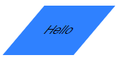
سلام به این صورت میشود :
<!DOCTYPE html>
<html>
<head>
<title>Page Title</title>
<style>
a.button_link{
  box-sizing: border-box;
  color: #fff;
  text-decoration: none;
  text-transform: uppercase;
  display: inline-block;
  position: relative;
  padding: 15px 20px;
  margin: 40px 40px;
  background: linear-gradient(to right, #a200ff, #894cff);
  transition: background-color 0.3s;
  transform: skew(-20deg);
}
a.button_link:after{
  content:'';
  display: inline-block;
  top: 0;
  bottom: 0;
  left: 0;
  right: 0;
  position: absolute;
  background: transparent;
  z-index: -1;
  transition: all .3s;
}
a.button_link:hover:after{
  background: #894cff;
}
a.button_link>.name{
  display: inline-block;
  transform: skew(20deg);
}
a.button_link:before{
  content:'';
  width: 2px;
  height: 90%;
  display: inline-block;
  top: -10px;
  left: 10px;
  position: absolute;
  background: #fff;
  z-index: 1;
  transition: all .3s;
}
a.button_link:hover:before{
  background: #894cff;
  top: 0;
  height: 100%;
}
a.button_link.blue{
  background: linear-gradient(to right, #63a4ff, #1976d2);
}
a.button_link.blue:hover:after{
  background: #1976d2;
}
a.button_link.blue:hover:before{
  background: #1976d2;
}
</style>
</head>
<body>

<a href="#" class="button_link blue">
  <span class="name">Hello</span>
</a>

</body>
</html>
گزارش تخلف
کپی کردن
0
@sinashahoveisi
این شبه عناصری (before, after) که در کدهاتون قرار دادین به چه کاری میان؟
روی متوازی الاضلاع که تاثیری ندارند، کاربردشون چیه؟
گزارش تخلف
کپی کردن
1
گزارش تخلف
کپی کردن
0
گزارش تخلف
کپی کردن
1